SwipeSwipe

SwipeSwipe
SwipeSwipe
SwipeSwipe
Fintech
SASS
Empowering Financial Freedom with SwipeSwipe – A Smart Budgeting plugin (SaaS product)
Company

Sanofi
Year
2025 - present
My role
My role
Too Much Information,
Not Enough Clarity
Too Much Information,
Not Enough Clarity
Simplifying Financial Management for the Everyday User
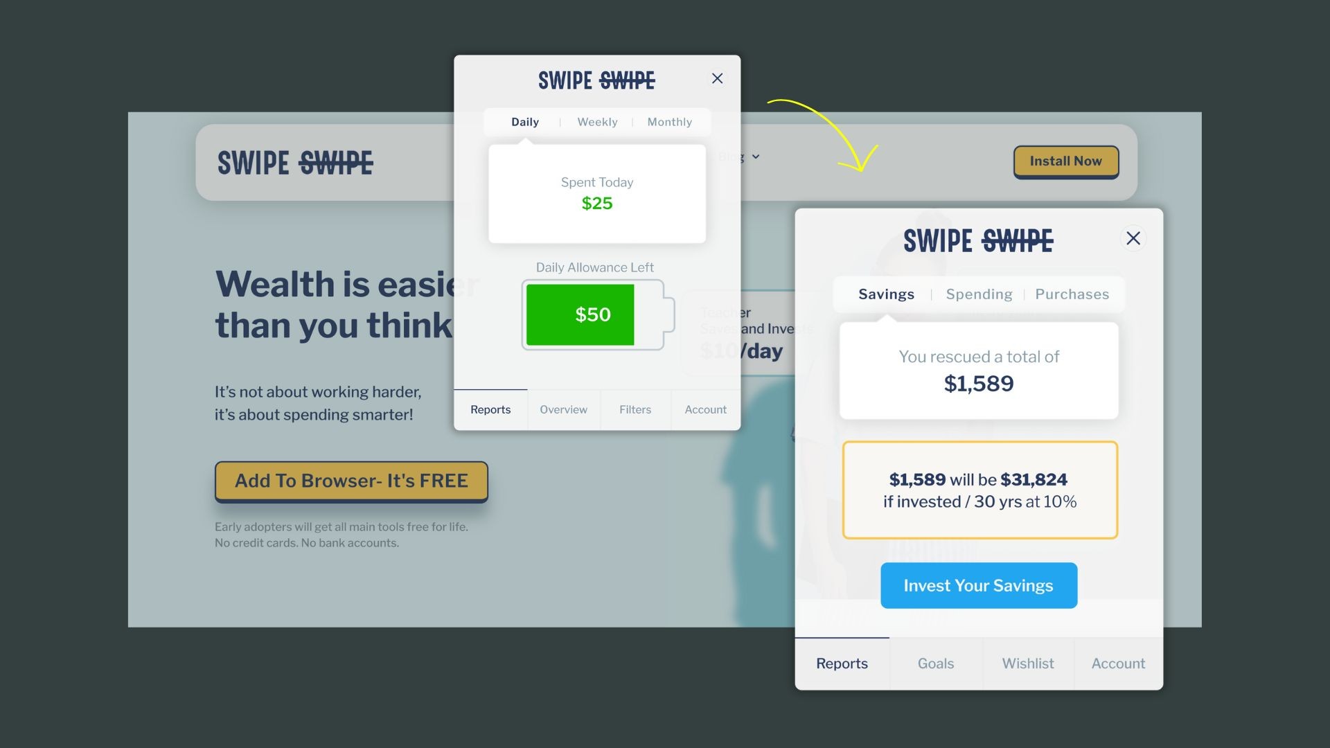
The existing SwipeSwipe interface bombarded users with too much information. It lacked focus, and users were left feeling lost rather than empowered. There was no central hub, no intuitive dashboard where users could easily see their financial health in one glance. On top of that, key features like the substitute engine, which helped users make smart saving or investing decisions, were hidden deep within the cluttered design.
Simplifying Financial Management for the Everyday User
The existing SwipeSwipe interface bombarded users with too much information. It lacked focus, and users were left feeling lost rather than empowered. There was no central hub, no intuitive dashboard where users could easily see their financial health in one glance. On top of that, key features like the substitute engine, which helped users make smart saving or investing decisions, were hidden deep within the cluttered design.
Projects worked on relaed to
healthcare ecosystem
Projects worked on relaed to
healthcare ecosystem

01
01
Building Trust into a Federated Health-Data Platform
Building Trust into a Federated Health-Data Platform
Simplifying Financial Management for the Everyday User
The existing SwipeSwipe interface bombarded users with too much information. It lacked focus, and users were left feeling lost rather than empowered. There was no central hub, no intuitive dashboard where users could easily see their financial health in one glance. On top of that, key features like the substitute engine, which helped users make smart saving or investing decisions, were hidden deep within the cluttered design.
Simplifying Financial Management for the Everyday User
The existing SwipeSwipe interface bombarded users with too much information. It lacked focus, and users were left feeling lost rather than empowered. There was no central hub, no intuitive dashboard where users could easily see their financial health in one glance. On top of that, key features like the substitute engine, which helped users make smart saving or investing decisions, were hidden deep within the cluttered design.
01
01
The Challenge
The Challenge
A federated health-data platform needed a researcher-facing portal — the surface where clinicians and analysts search hospital data, define patient cohorts, and run statistical studies, without any patient-level data ever leaving its source. A product spec and a partial workingprototype already existed. What didn't exist: a design that was trustworthy, coherent, and buildable on the company's design system.
The prototype worked, but it broke the platform's most important rule — internal technical routing language was leaking onto screens researchers would see. And the design system itself had never been asked to speak this language before: it was built for patients and caregivers, not for a data scientist deciding whether to trust a statistical result they didn't compute themselves. I owned both sides of the fix: the screen-level design, and the system it would live in.
Simplifying Financial Management for the Everyday User
The existing SwipeSwipe interface bombarded users with too much information. It lacked focus, and users were left feeling lost rather than empowered. There was no central hub, no intuitive dashboard where users could easily see their financial health in one glance. On top of that, key features like the substitute engine, which helped users make smart saving or investing decisions, were hidden deep within the cluttered design.
Process
From Chaos to Clarity with Strategic UX Design
Due to NDA restrictions, please reach out to know more about the in detail process
Solution
These are the main screens of the extension

Report
Goals
Wishlist
Account


more
more