SwipeSwipe

Empowering Financial Freedom with SwipeSwipe – A Smart Budgeting plugin (SaaS product)
Company

SwipSwipe
Team
CEO
Creative Head
Developer
UI/UX Designer (me)
Year
2024
Imagine managing your finances with ease—whether it's tracking your spending, saving, or investing, SwipeSwipe was created to help users achieve financial freedom. But here’s the catch: the original version was far from simple. It was overwhelming, cluttered, and far too complex for everyday users.
That’s where I came in.


I knew that to solve this, the answer wasn’t to add more features but to simplify what was already there. My goal was to strip away the clutter and create something that would make users feel confident in their decisions.
1
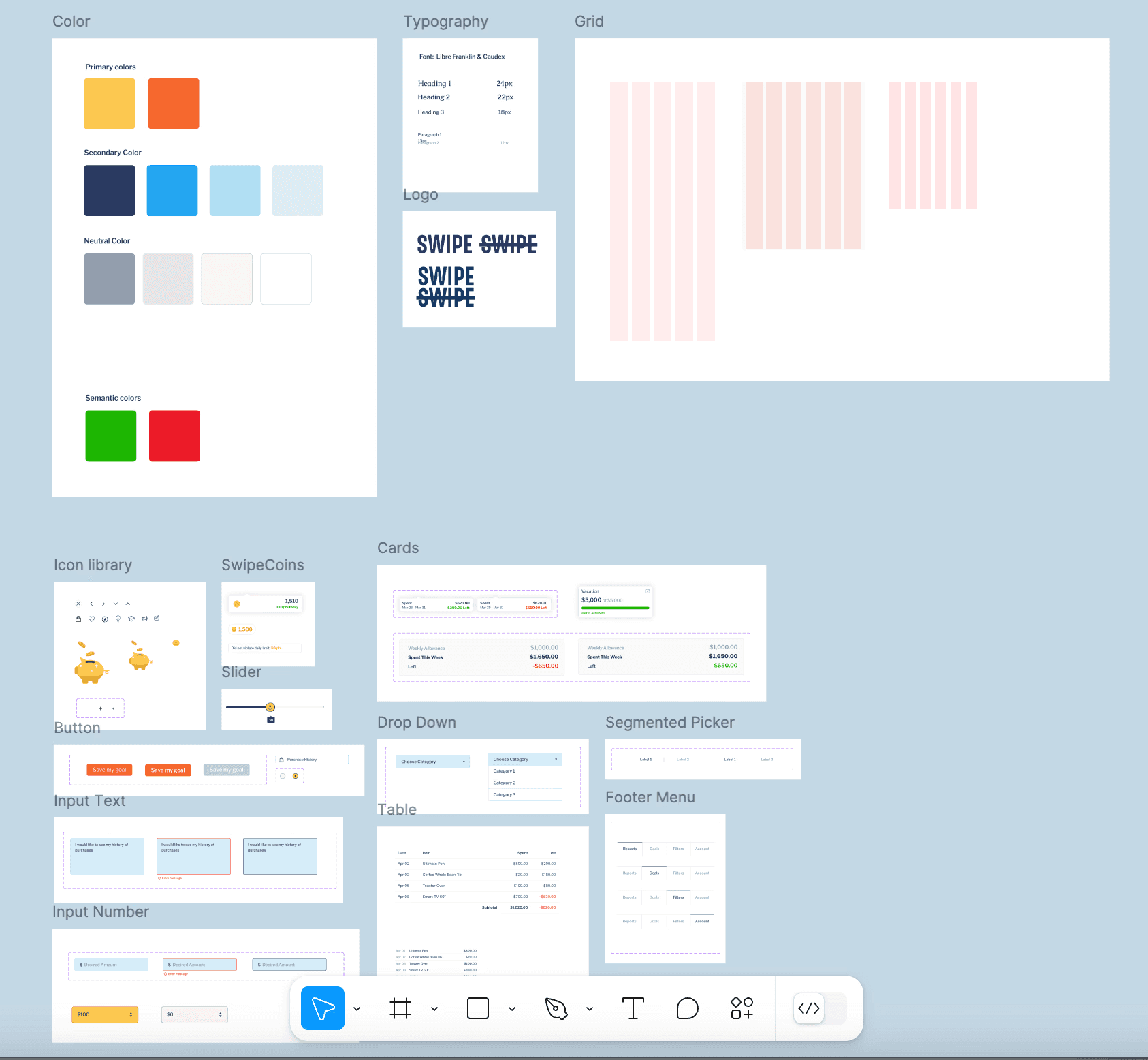
Simplify the plugin interface
I took the most important page
— The Account: tracking points, purchase history, resources & feedback
— and reorganized them into a cleaner, more intuitive design.
I wanted users to feel that they were in control, not battling with endless buttons.


Build a centralized dashboard.
This was the missing piece—a place where users could see all their financial data in one clean, easy-to-read space. The new dashboard would allow users to see how much they’ve saved, how much they’re spending, and what investments they could make to grow their wealth.


After addressing the plugin’s issues, it became clear that users needed more than isolated fixes. They needed a unified system to manage their finances holistically. A simple, well-designed dashboard could provide an at-a-glance view of their spending, saving, and investing habits—without switching between systems or features.


The redesign didn’t just make SwipeSwipe look better—it had real, measurable impacts on user behavior: